


Pequity Rebrand
Crafting a new identity for a compensation equity leader

The Original Branding
A font-based script logotype and a nostalgic nod to a late beloved pet served the Pequity adequately through its initial and early-growth stages, but had begun to prompt too much confusion as to the nature of its product as it began to shift toward a more up-market enterprise client base.
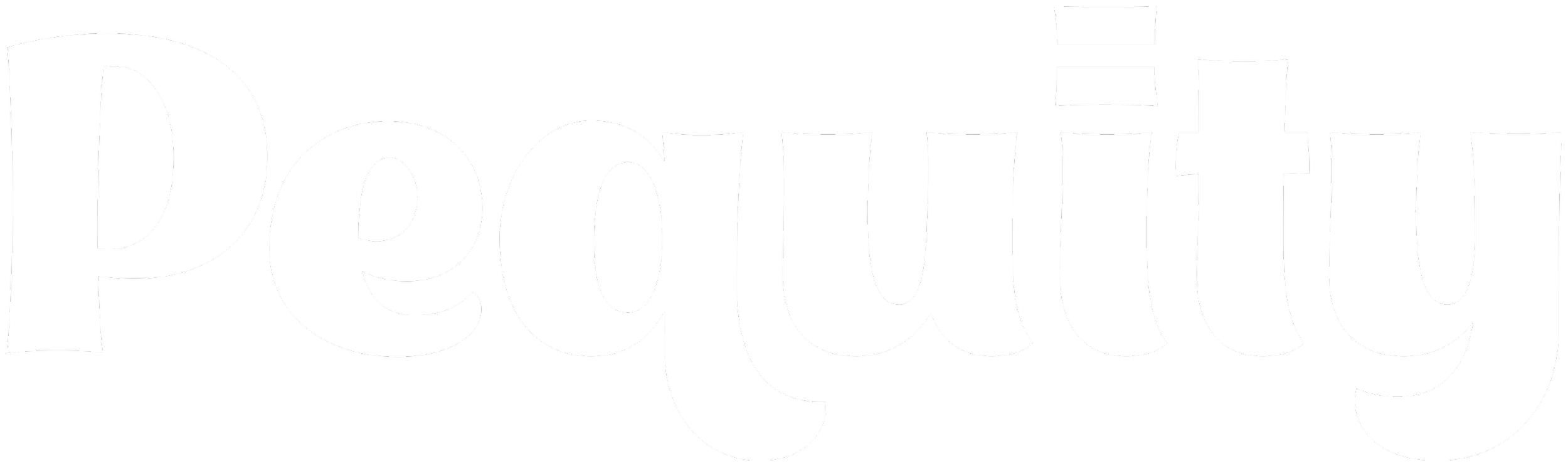
Script Redraw
The first approach was to rebuild the script logotype by hand to see if it still felt like enough of a fit for the brand, and potentially retain any accumulated brand equity established under the existing mark.
Further Logotype and Mark Exploration
It was decided that further exploration of a range of concepts for different logotype and logomark directions was needed.
Bold Approachable Script
This hand-drawn script was presented as the recommended direction, and paired with several of the logomark options.
Alternate Looks
For good measure, the evolved script and the clean sans-serif logotypes were also shown in lockups with some of the marks, as well as some brief exploration of several marks incorporating the initial ‘P’ from the script.
Simplified Logotype
In the end, we opted for the simplicity and strength of a standalone logotype, based on the initial recommended direction. The script was disconnected, but the descenders were redrawn to maintain the more casual, approachable tone of the original. The tittle of the ‘i’ was replaced with a custom equal sign, styled to match the attitude of the letters, that could also stand alone as an iconic mark when needed.