Hamrick & Leander ISD
Nine great months of art and design at a large school district
Evolution of District Branding
One of the first things I couldn’t resist doing when arriving at Leander ISD, was making some subtle but much-needed tweaks to the district’s compass rose branding, to improve and correct their construction.
Child Find Logo
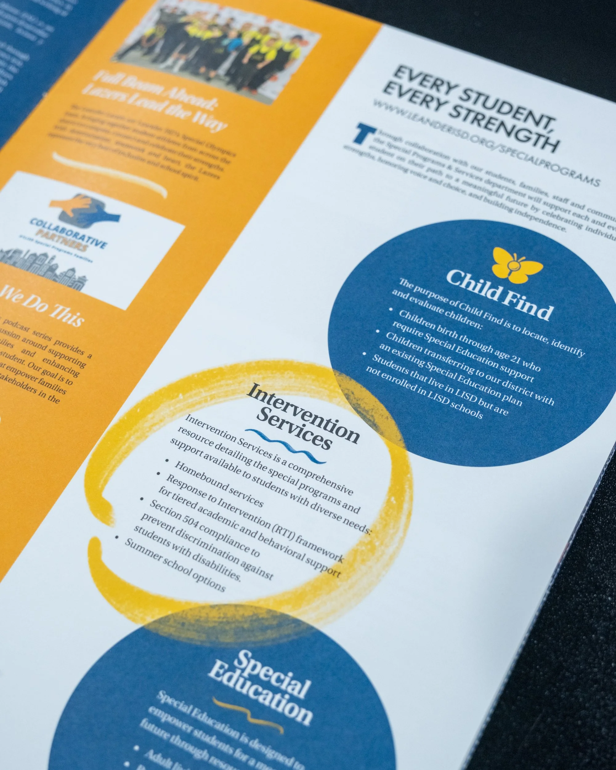
Leander ISD’s Child Find department was looking to freshen up its look before a new awareness push, and wanted a logo to go along with the campaign. The service aims to locate, identify, and evaluate children who may need special education support.
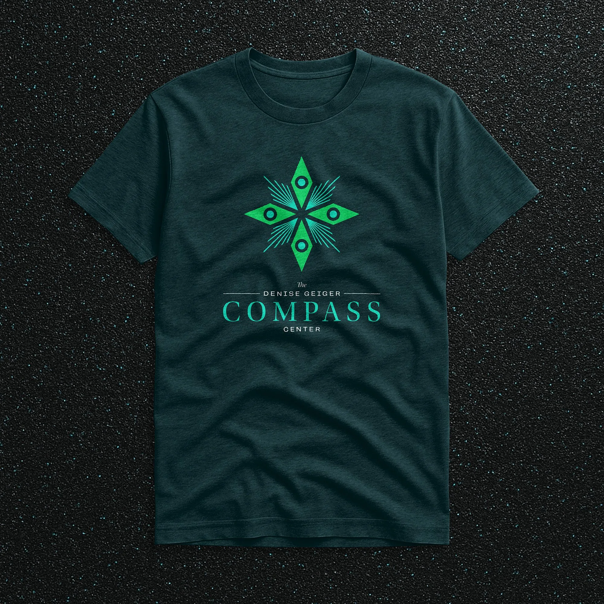
The Compass Center & Instructional Materials Center
One major project funded by Leander ISD’s 2023 bond election is the new joint facility being built for the transitional services program for special programs students who are 18 years old and beyond, and a warehouse and training center for storing instructional materials for the district, particularly custom-built science kits.
The land on which these facilities are being built had historically been known to be home to many peacocks, and the teams involved in the project set out to incorporate many of the birds’ blues and greens throughout the building in paint and tile colors, carpeting and more. So when I started developing the branding for the facilities, I wanted to incorporate as much of that inspiration as possible, too.
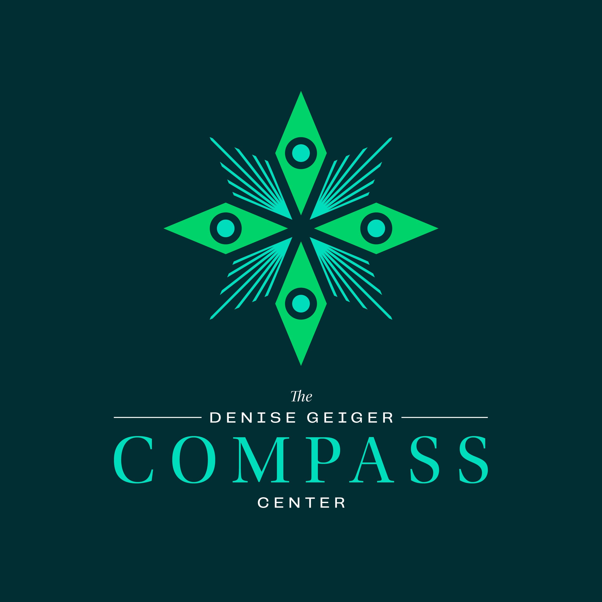


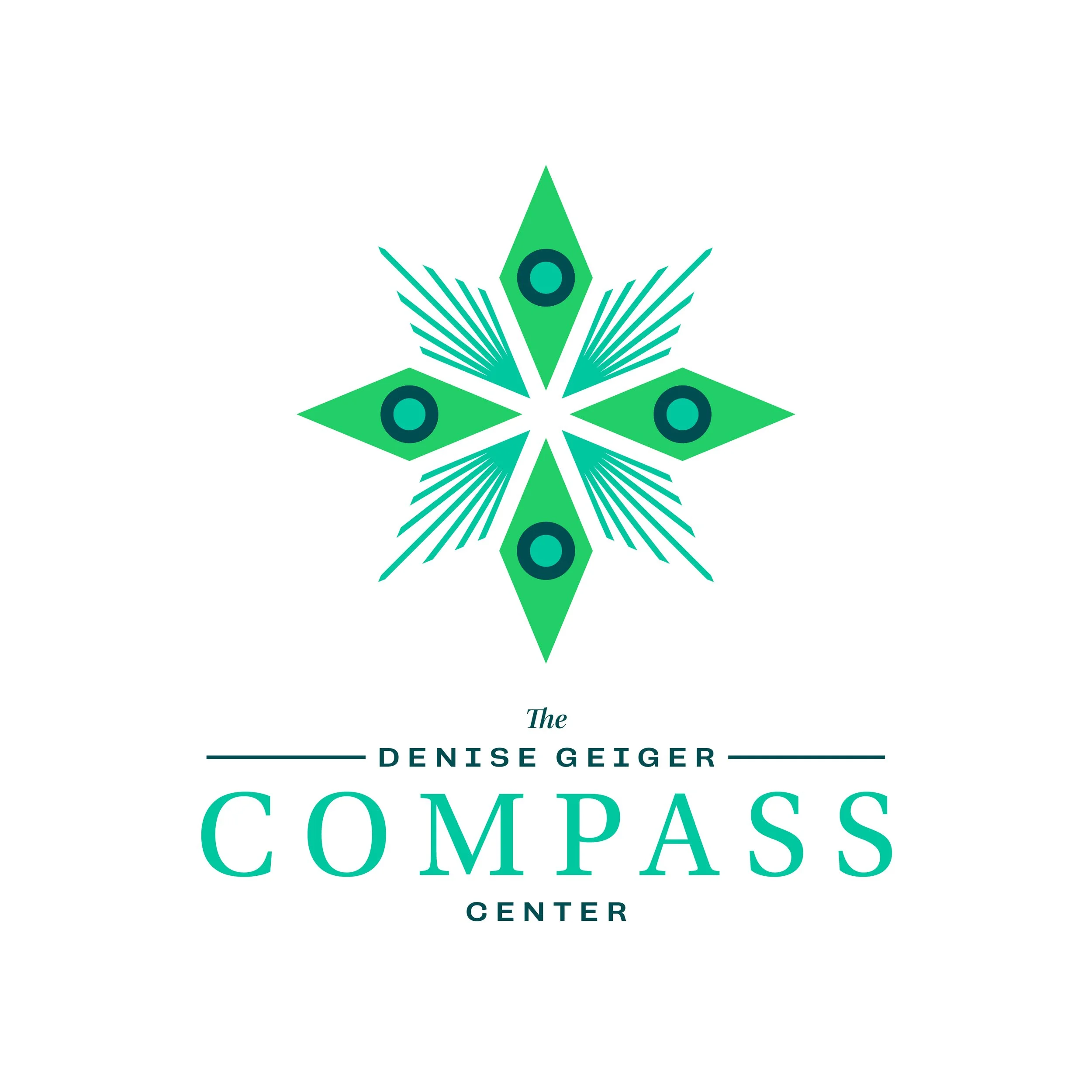

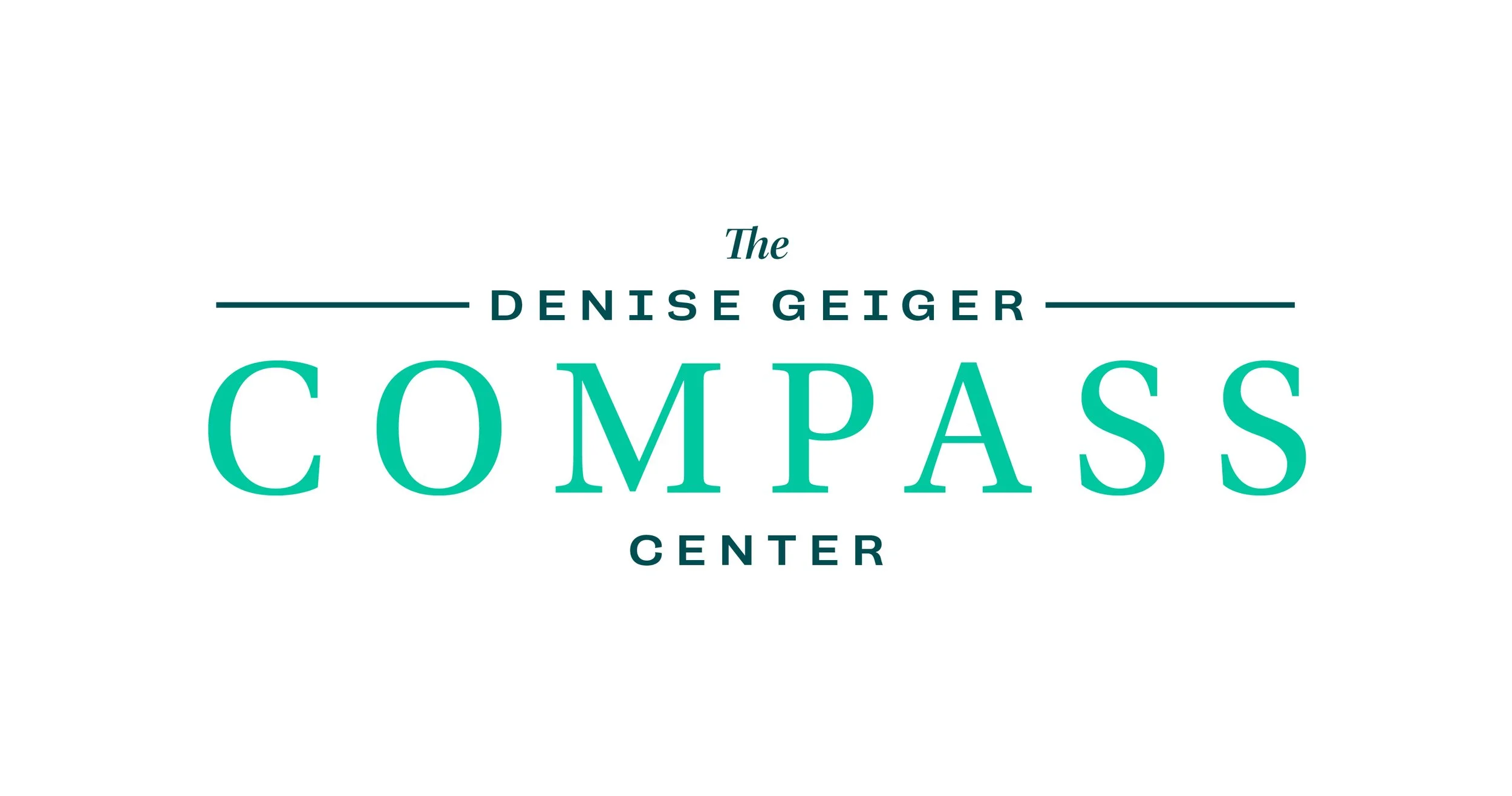
With the Instructional Materials Center sharing the same space, and with its entrance being directly across from that of the Compass Center, I wanted to tie the two brands together as much as possible. Using the same palette of colors, and setting the names of the two facilities in the same typefaces and hierarchies, the brands have a shared visual language that will work well together in any instances where they exist alongside each other.
In the secure vestibule at the front of the Compass Center, there is a 25’x7’ wall where I installed a hand-painted mural. “My Life, My Choice, My Voice” has been a recurring motto within the transition services program for years, and immediately jumped out as the best message to greet these remarkable kids as they arrive each morning. It’s hard to imagine a more deserving bunch than the educators and admins who work with these students every day, and I was honored to be able to liven up their space with some original artwork.
Leander High School Rebranding
Originally opened the same year I was born, Leander ISD’s first high school campus is in the middle of a massive renovation and modernization project that was also part of the bond funding from the 2023 election.
What began as an eleventh-hour effort to prevent a new competition gym floor from being installed with a less-than-elegant rogue design from the coaching staff has blossomed into so much more. After meeting with campus leadership, it was revealed that the fundamental problem was an overall desire for a change from their 10+ year old lion logo. And so, a more comprehensive rebrand effort was officially underway.

Custom typeface in development for use across the district in athletic type treatment elements of campus rebrand projects. Leander ISD is a “Nike District”, meaning that all of its jerseys and equipment are purchased from them. So I started from Futura Condensed Bold as an efficient way to establish some natural compatibility in any instances where campus branding exists alongside Nike branding.
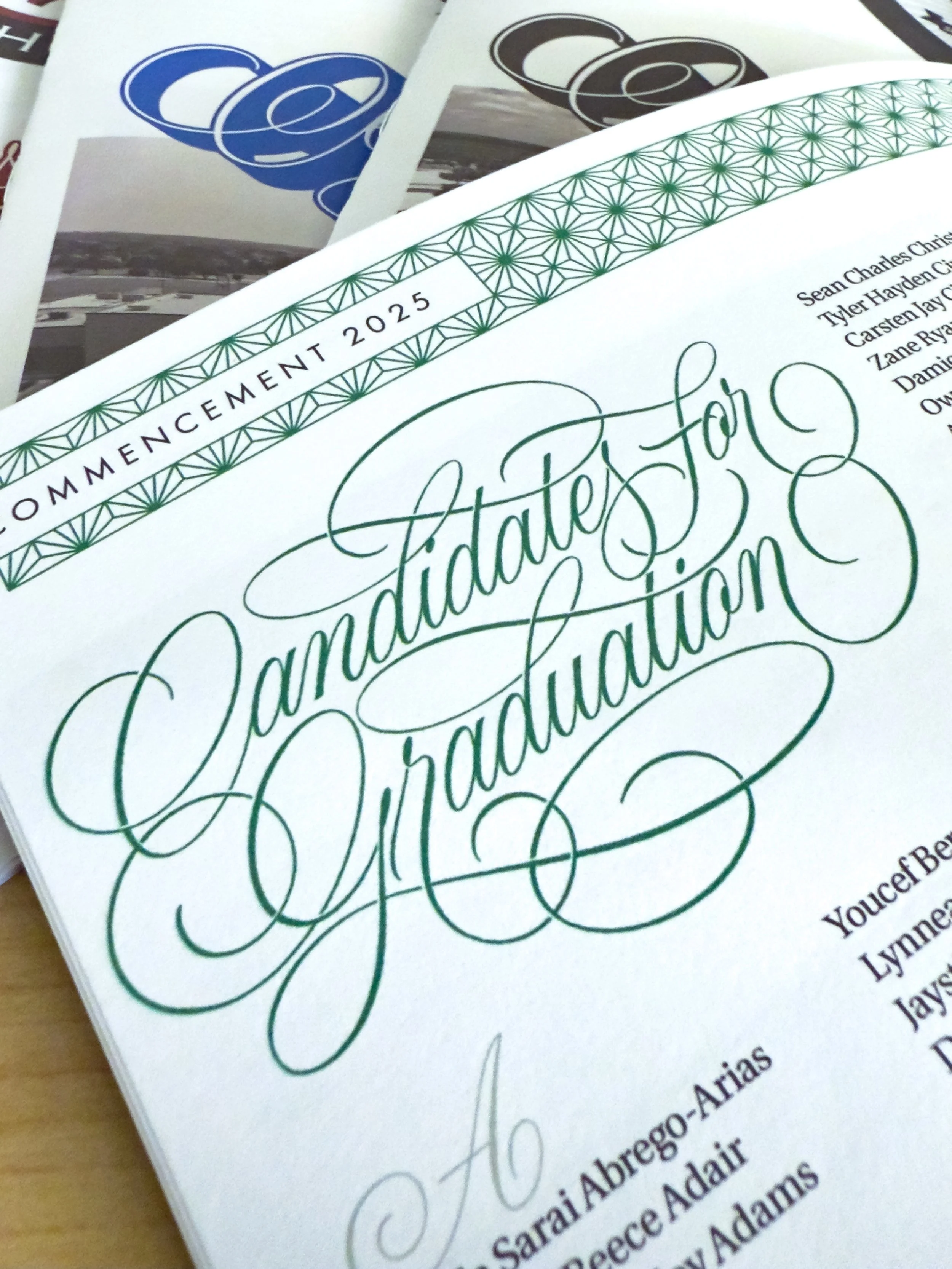
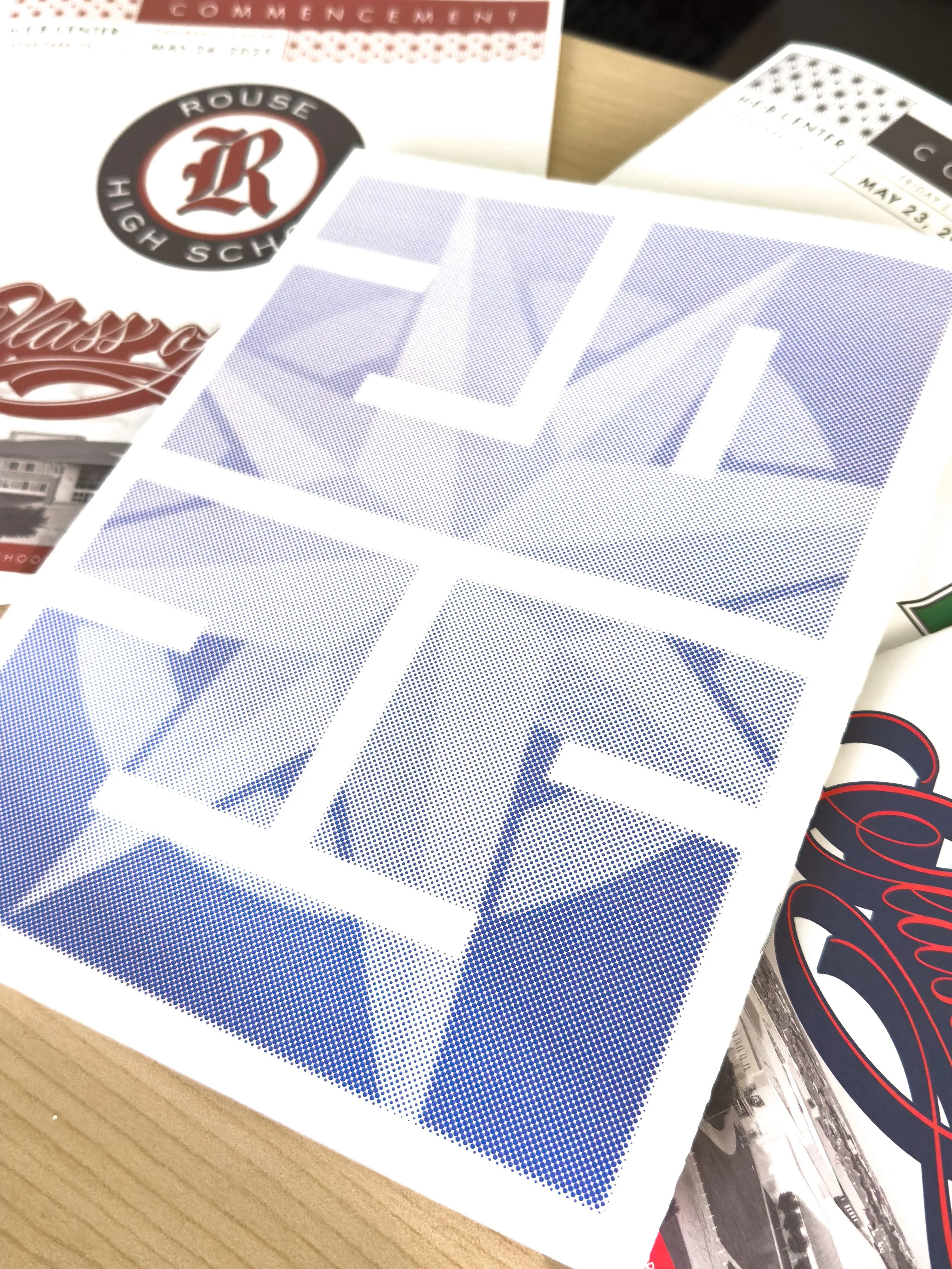
Graduation 2025
Every spring, the yearbook and journalism teachers at each high school campus begin the massive undertaking of designing and building out the commencement programs for their schools’ graduating seniors. Over the years, the different programs had gotten further and further from any kind of visual standard—something no one at any individual ceremony would ever notice, but for folks in district leadership, the board of trustees, and anyone else attending all of them, we decided it would be nice for them to see some district unity across the different programs.
I planned to build an InDesign template I could easily save out with each school’s colors and branding, but I wanted to connect with all the campus teachers first, and get feedback from them on which elements they cared most about being able to customize. As it turned out, they were actually just volunteered to do this every year because they were the only people at their campus who knew how to use InDesign, and what they cared most about was having as little to do with them as possible.
Being the district’s first legitimate design hire, no one before me would’ve known any better, but I then went right to the area superintendents and made the case that, for someone who knew what they were doing, this absolutely didn’t have to be a project that dozens of people needed to spend their time on at such a busy time of the school year. I just crafted a smart, well-structured template, and then provided the campuses with a Google spreadsheet built to collect all the student name data in ways that made it easy to just plug it in to each school’s program.

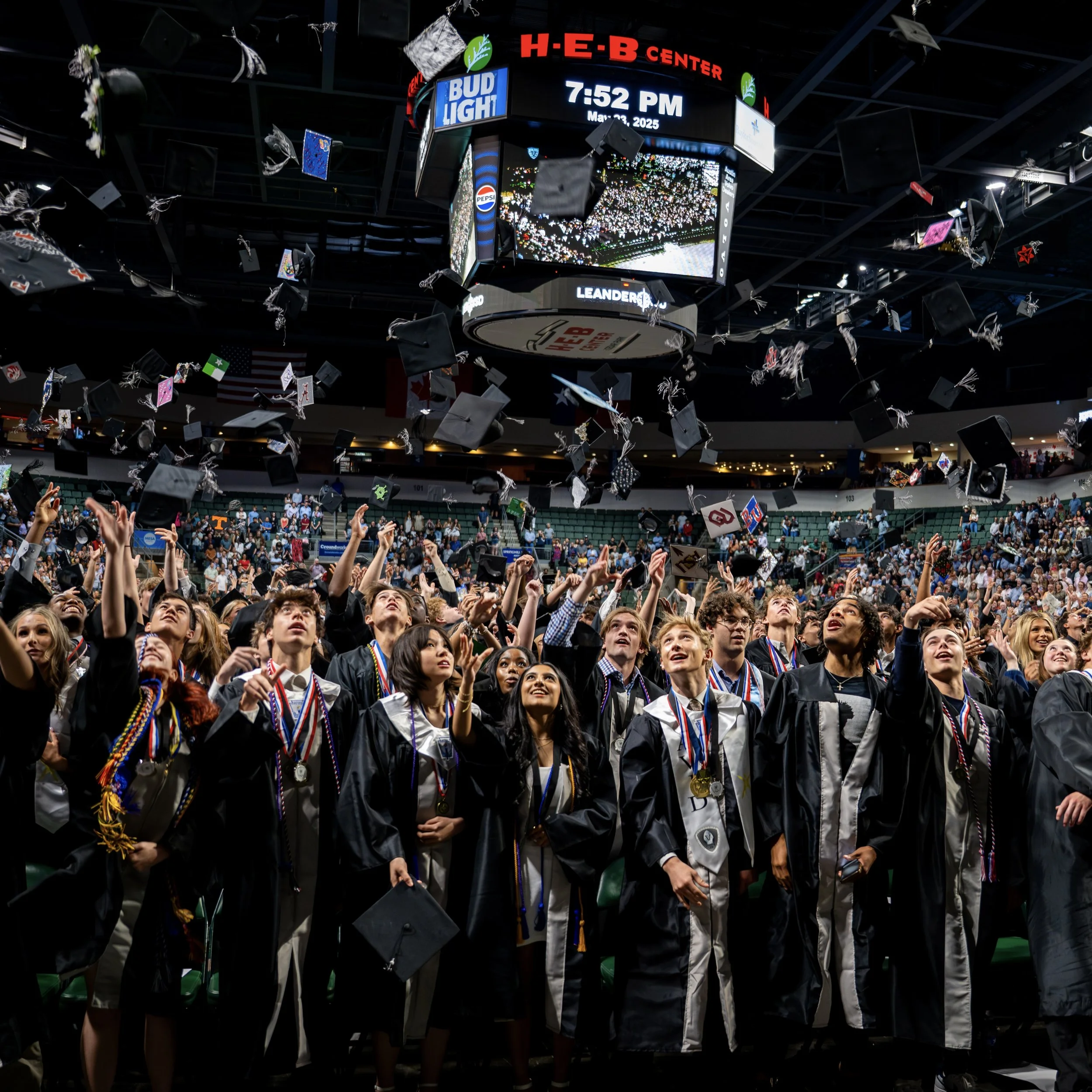
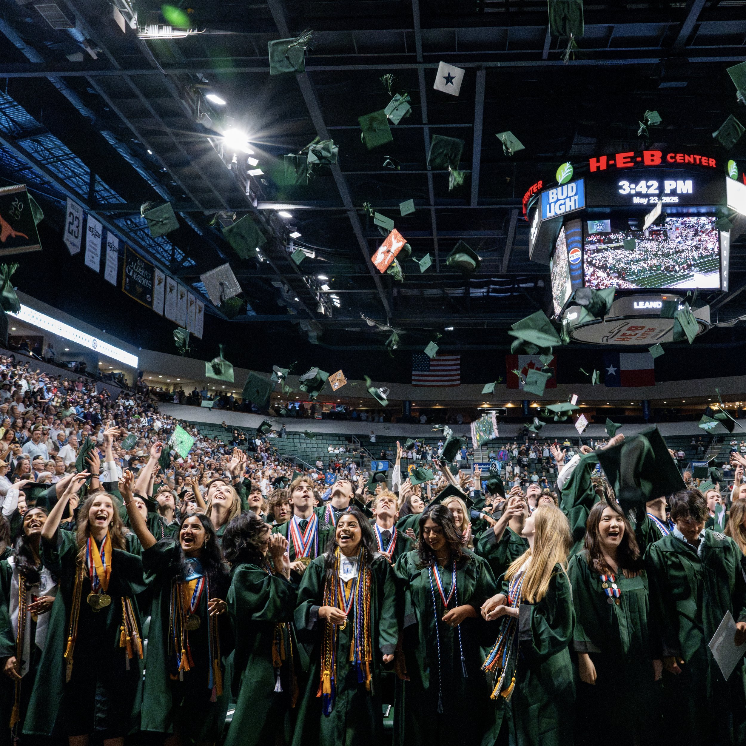
We were able to provide custom graphics for the the various screens at the HEB Center, to extend the design from each school’s program across numerous touch points throughout the ceremony.
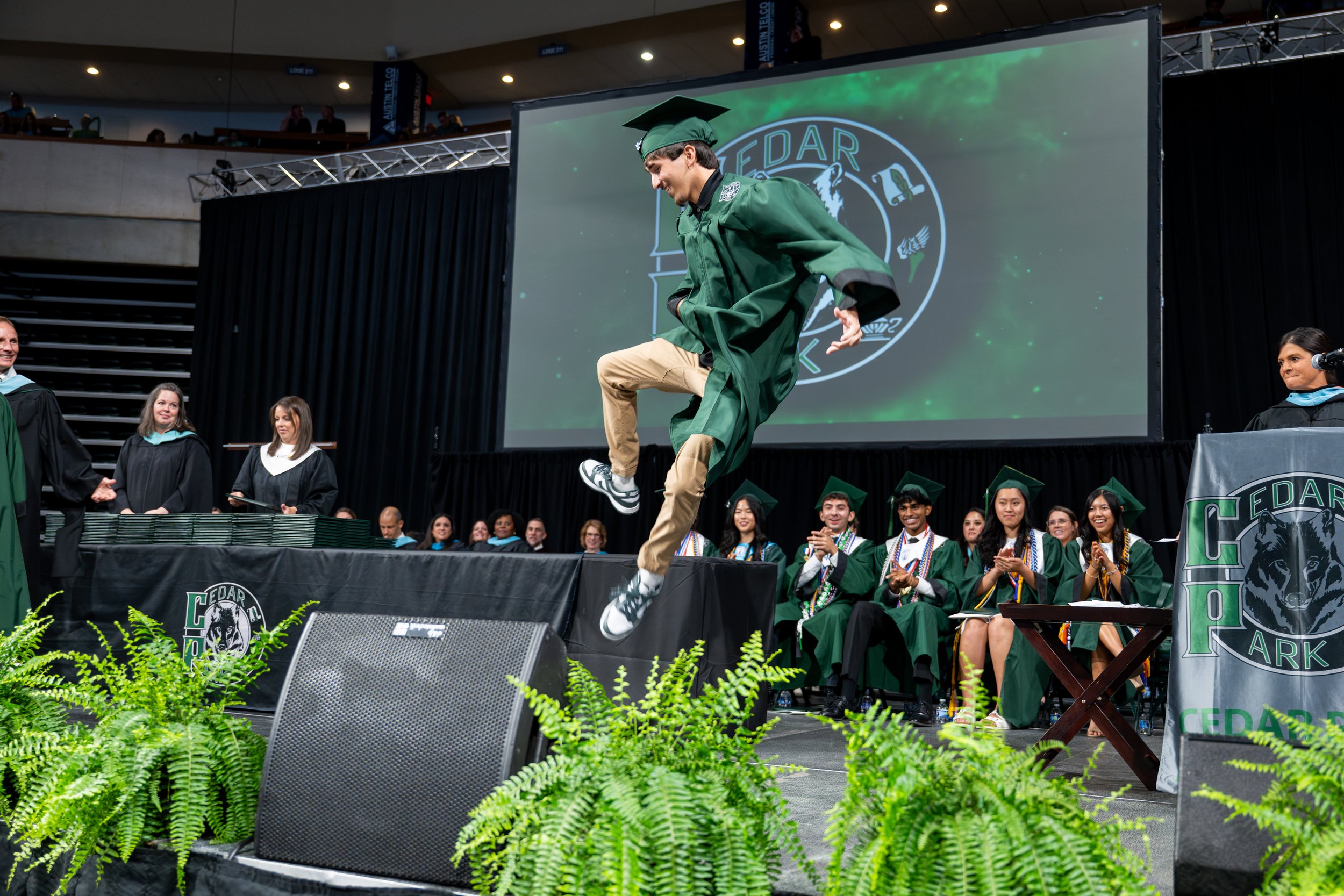
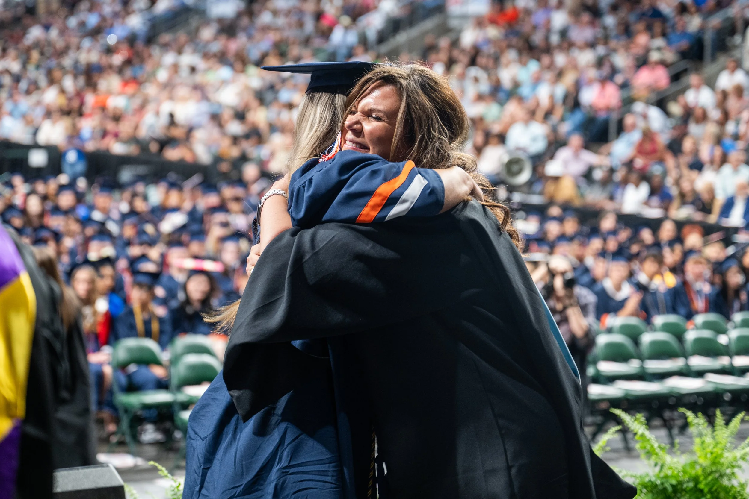
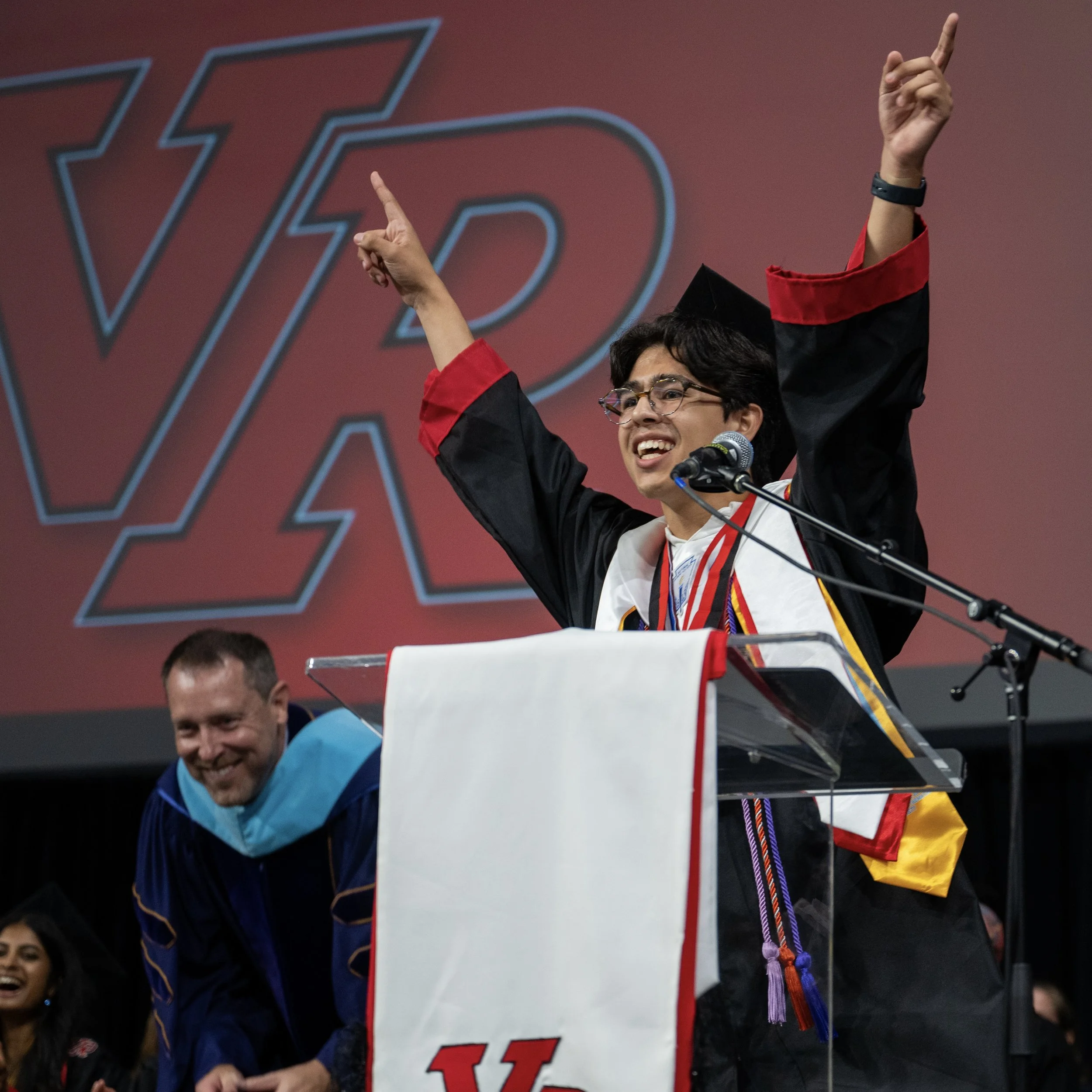
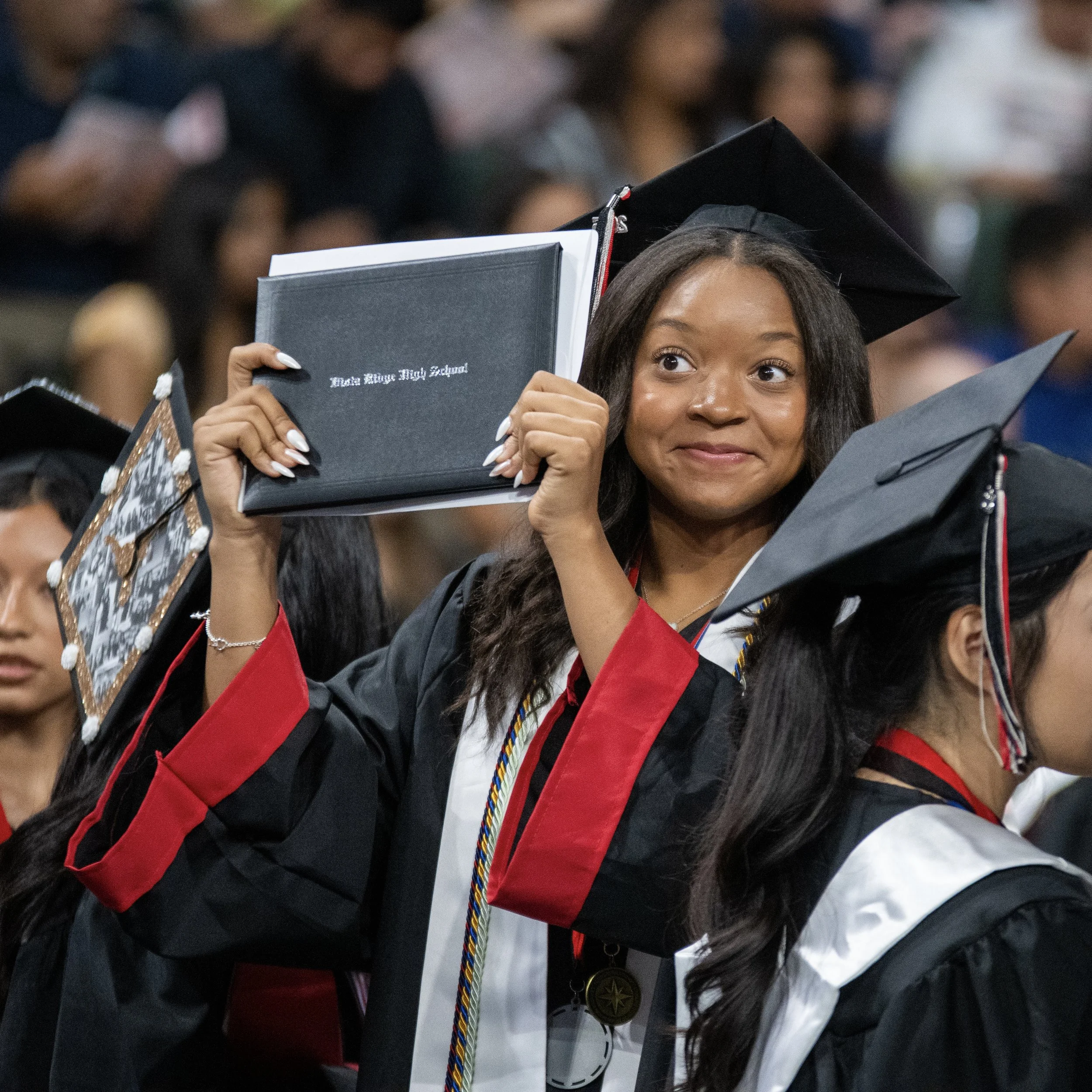
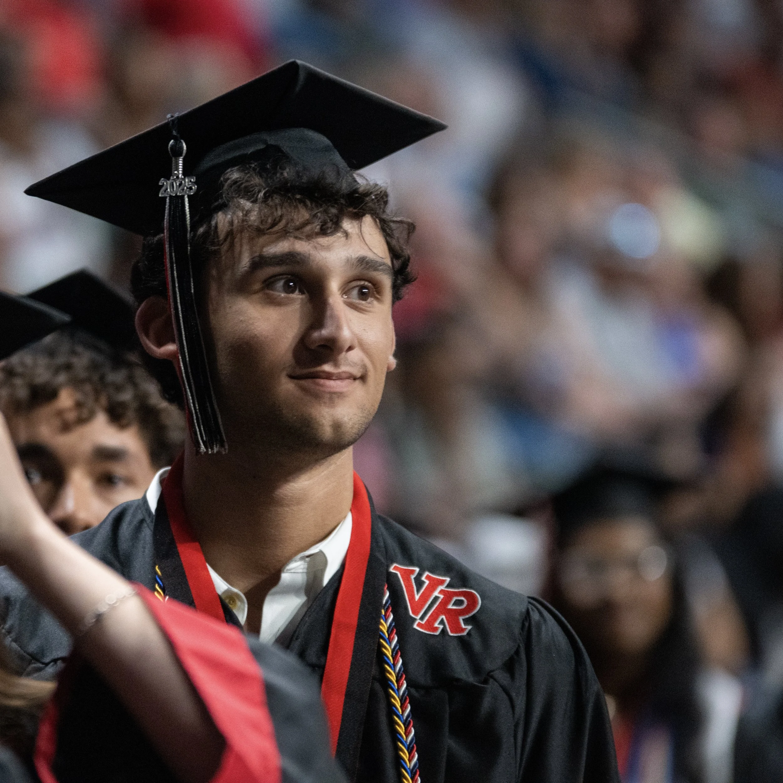
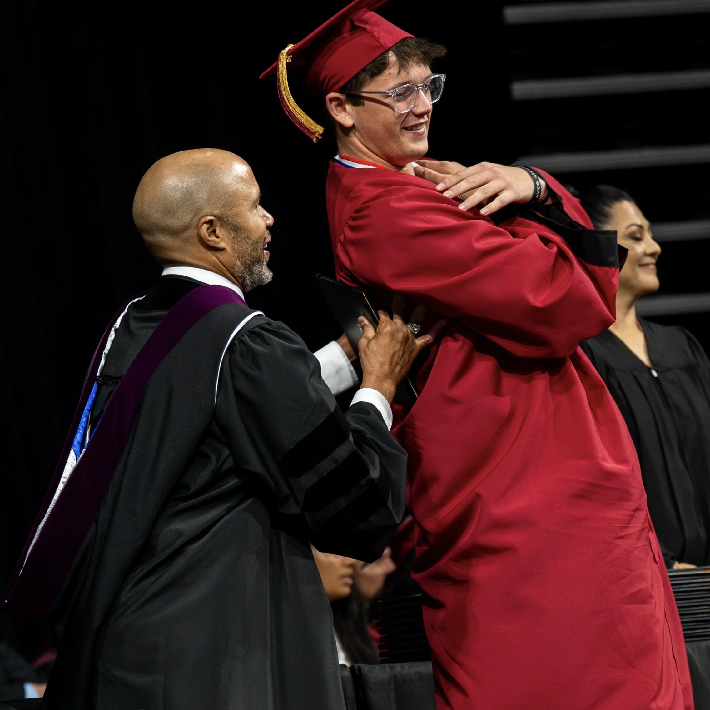
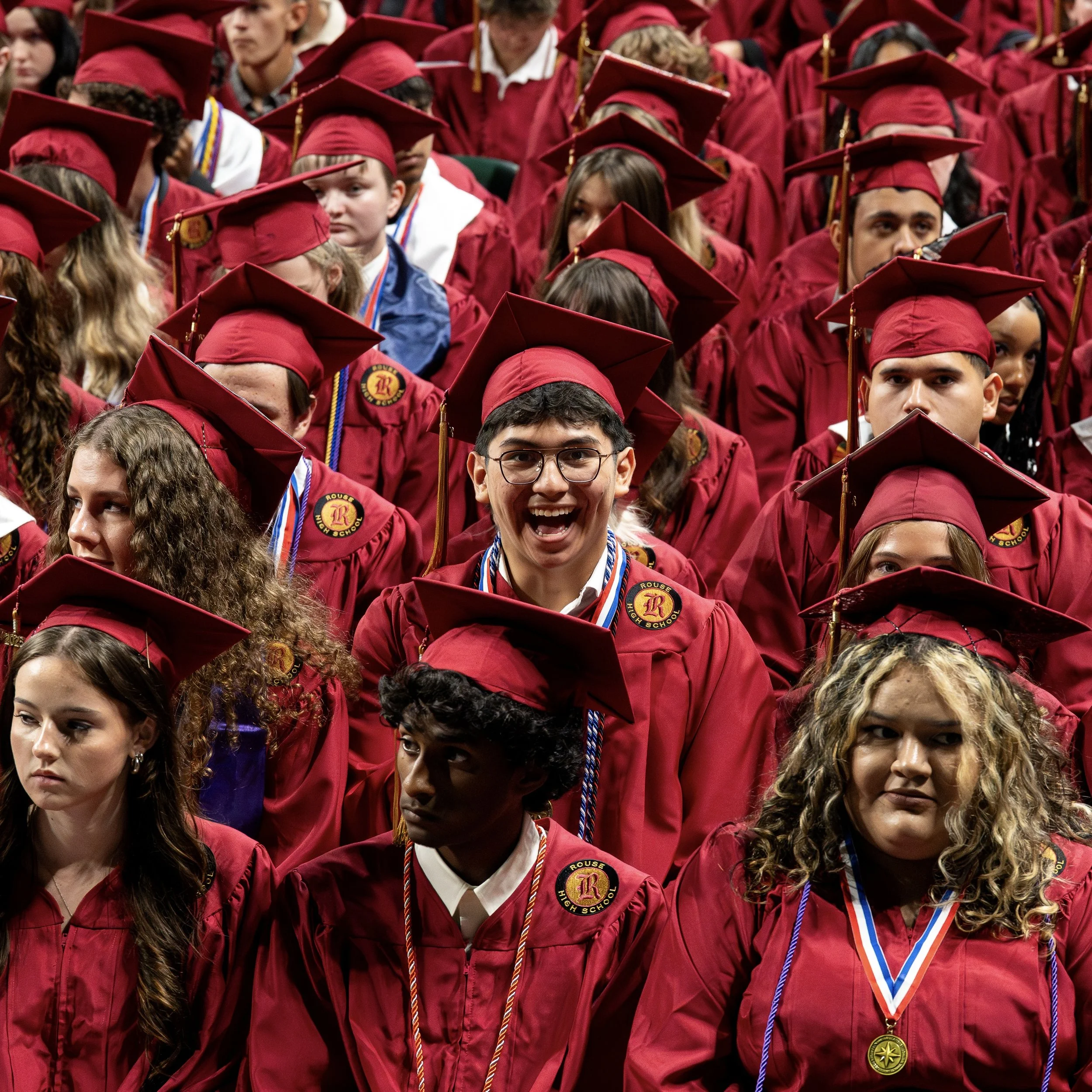
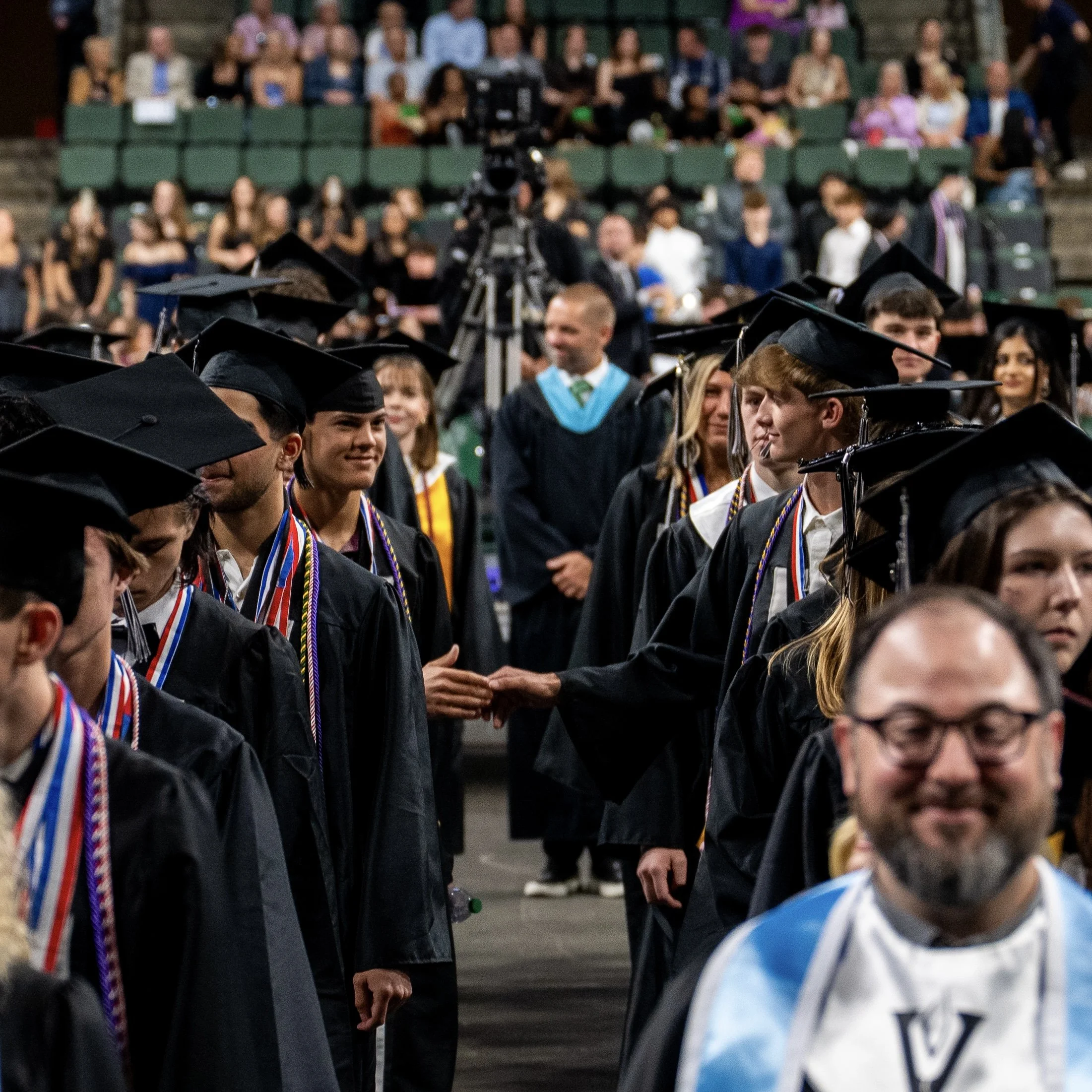
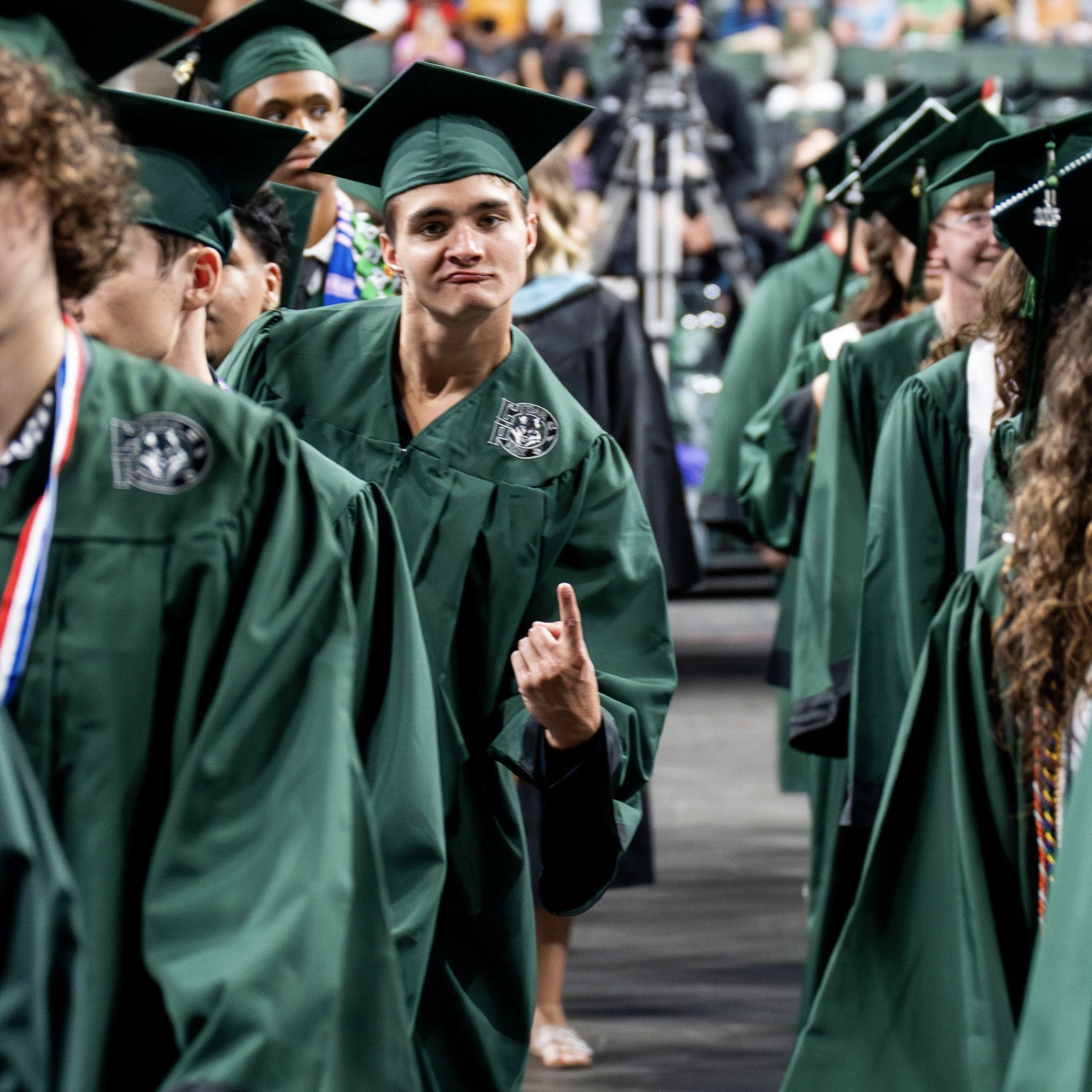
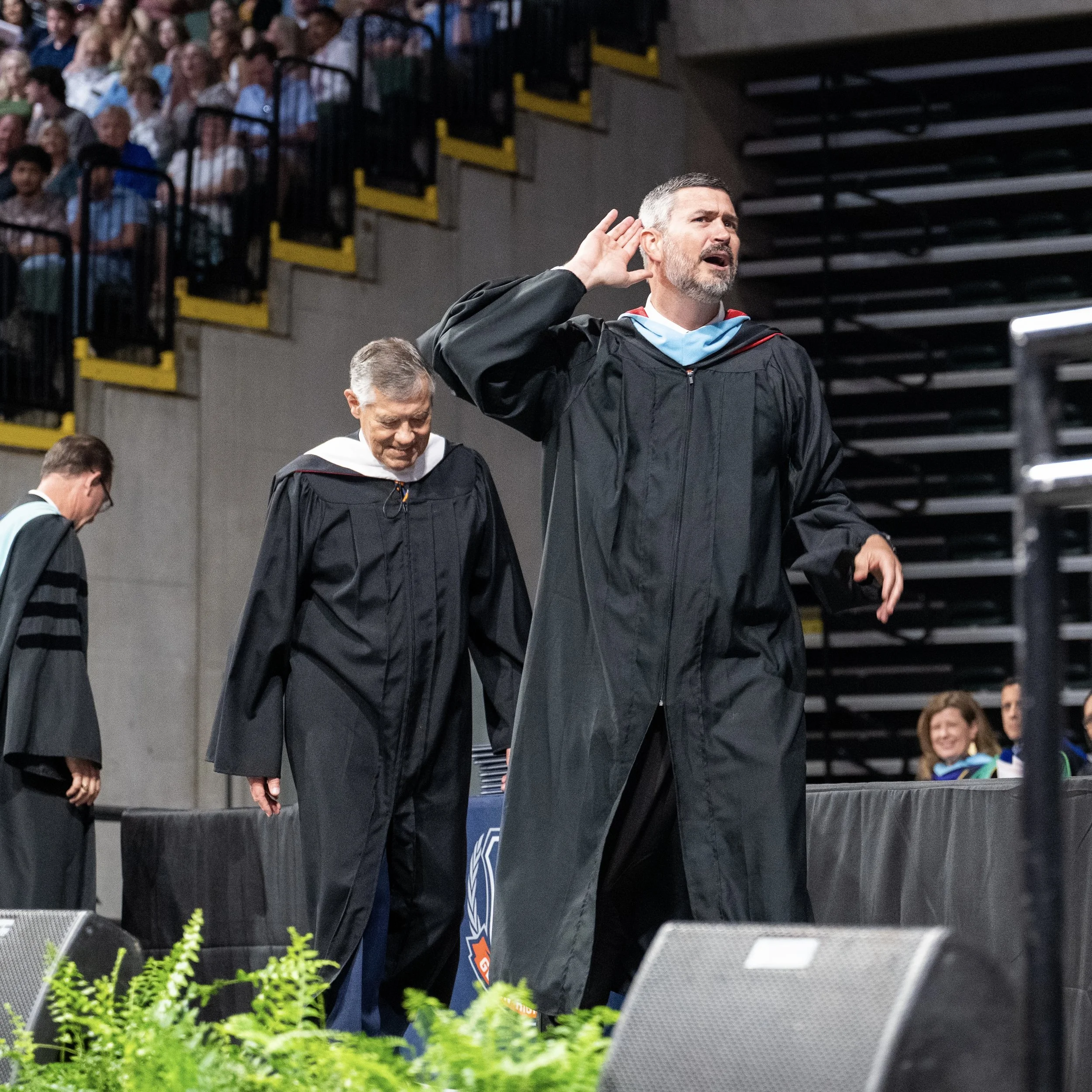
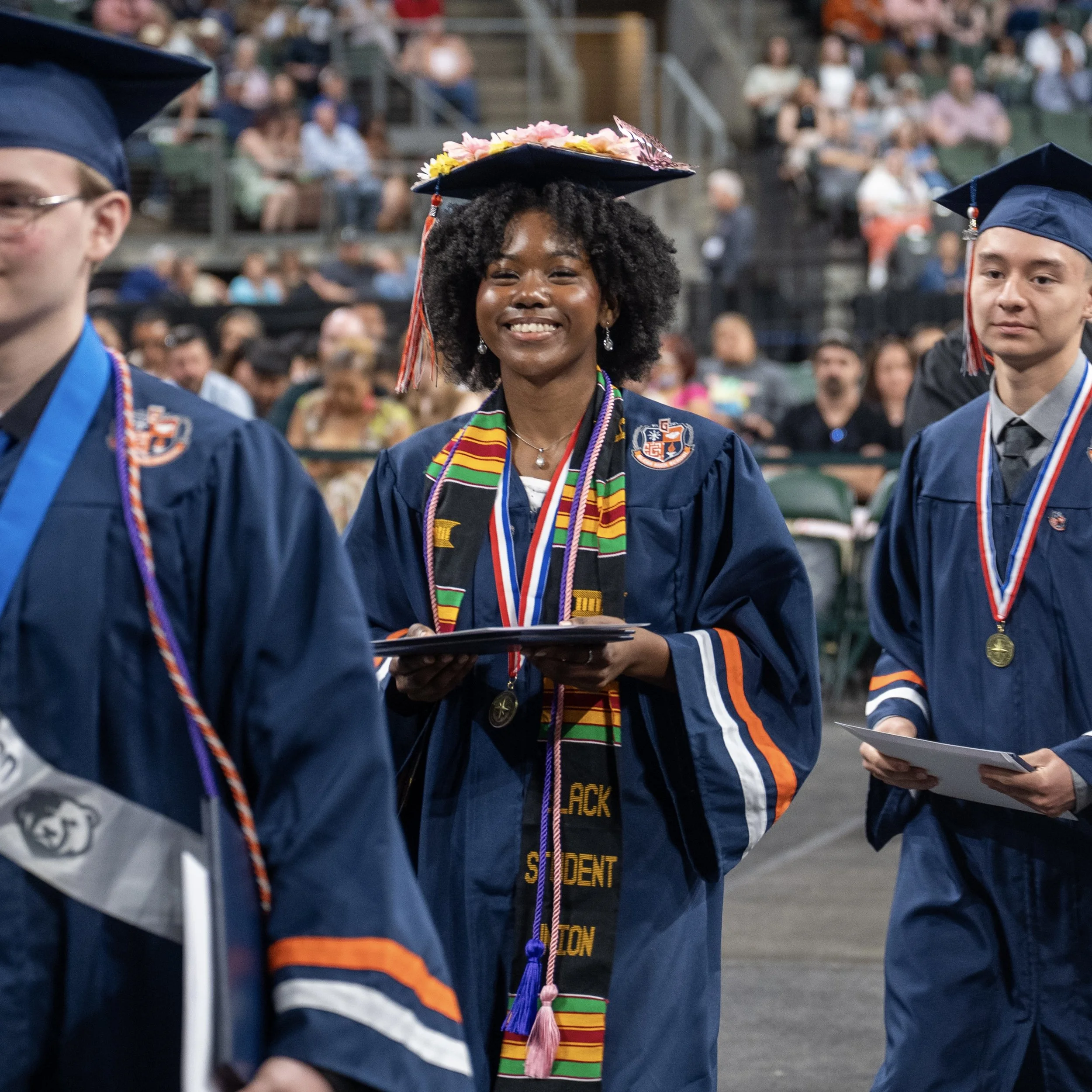
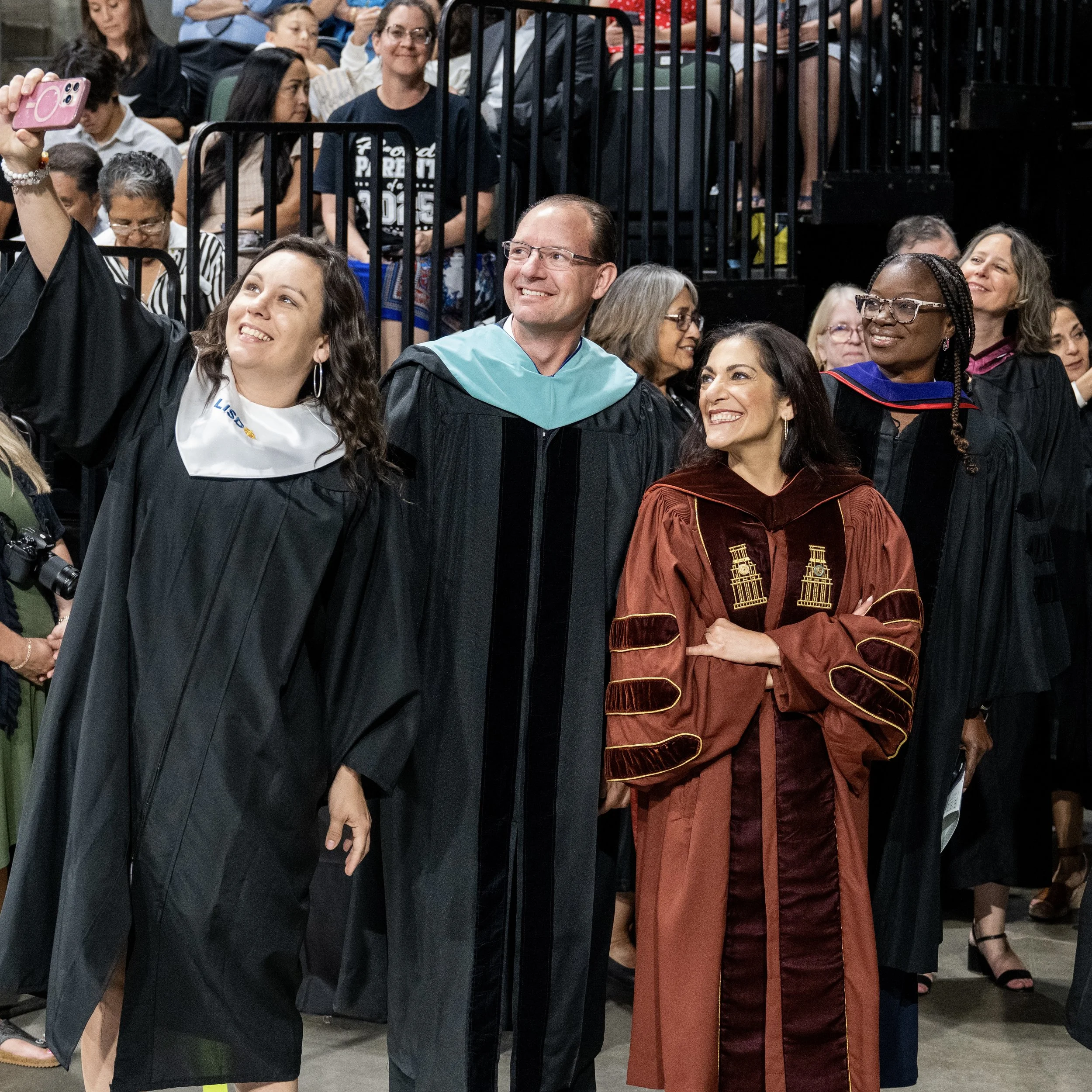
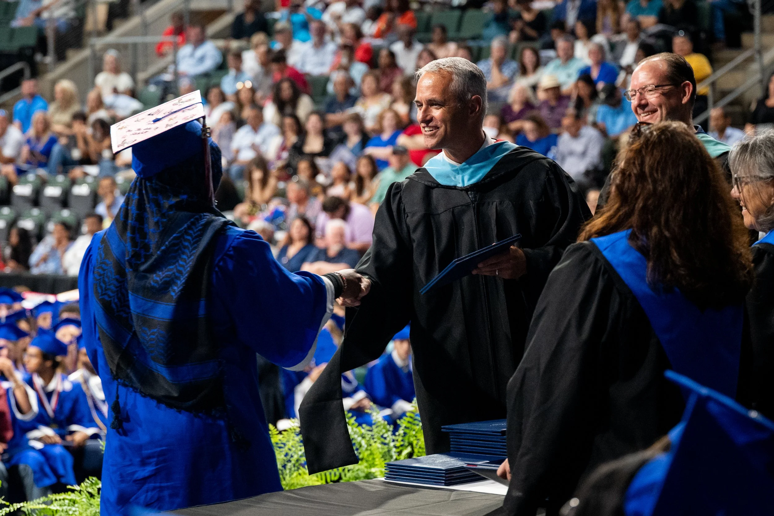
Ceremony Coverage
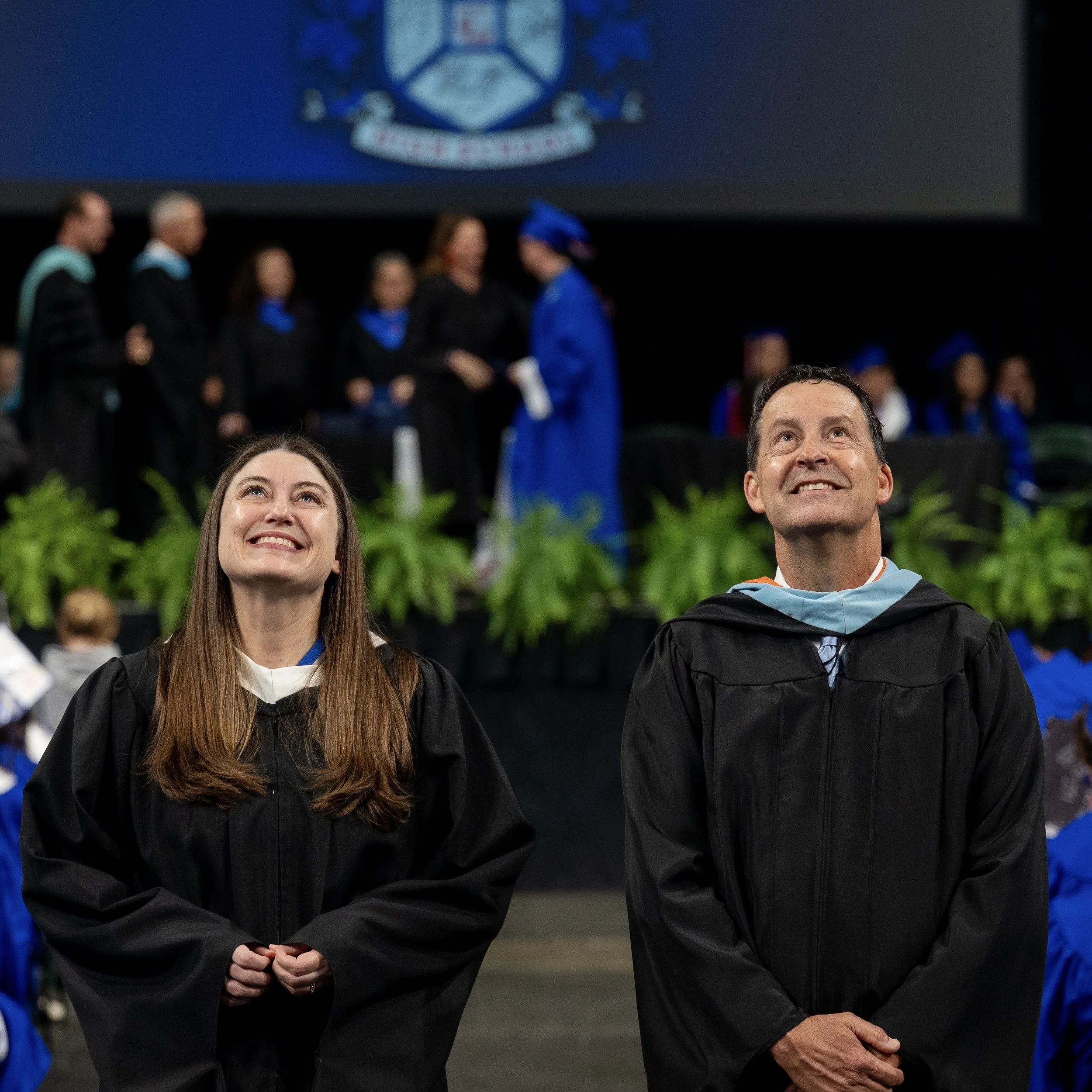
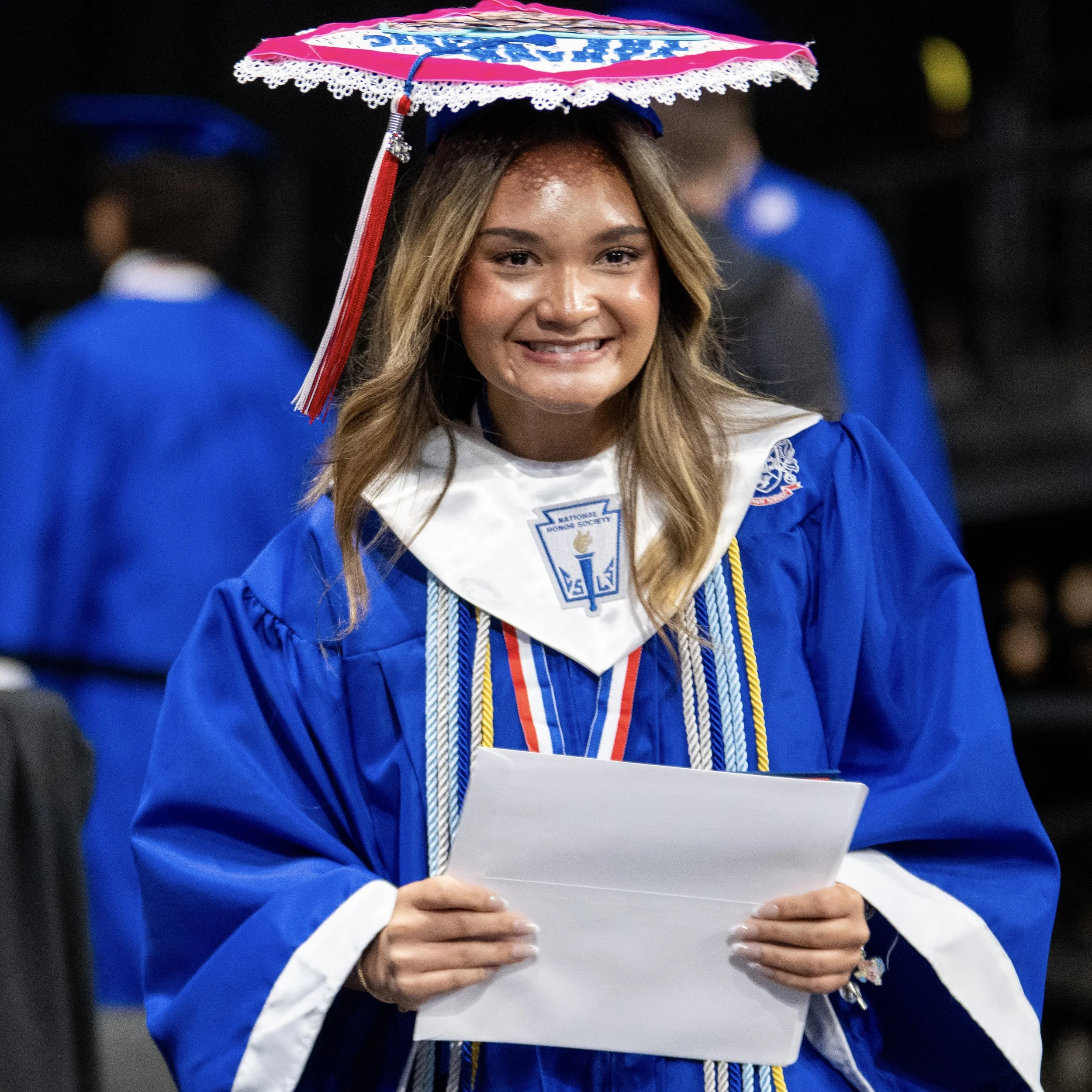
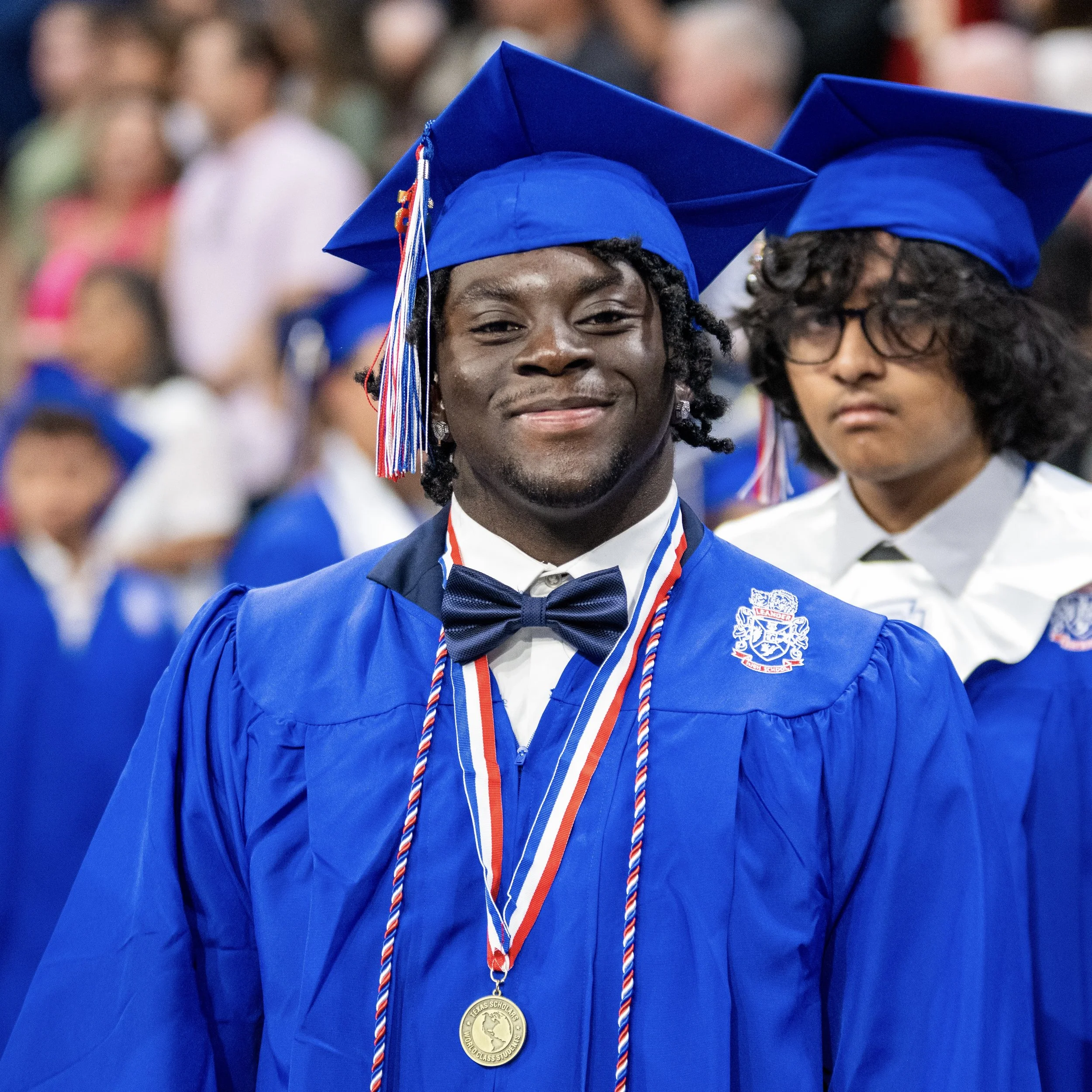
I’m part of a very lean team in the School & Community Relations department, and that often means we wear a lot of different hats. So when graduation weekend finally came around, we were also the ones making sure everything was beautifully captured and shared with the community. Personally, I was out there with a Nikon Z 8 strapped to each hip, and captured 19,564 images of roughly 3,300 students across the two days and six two-hour ceremonies.


Summer Publication
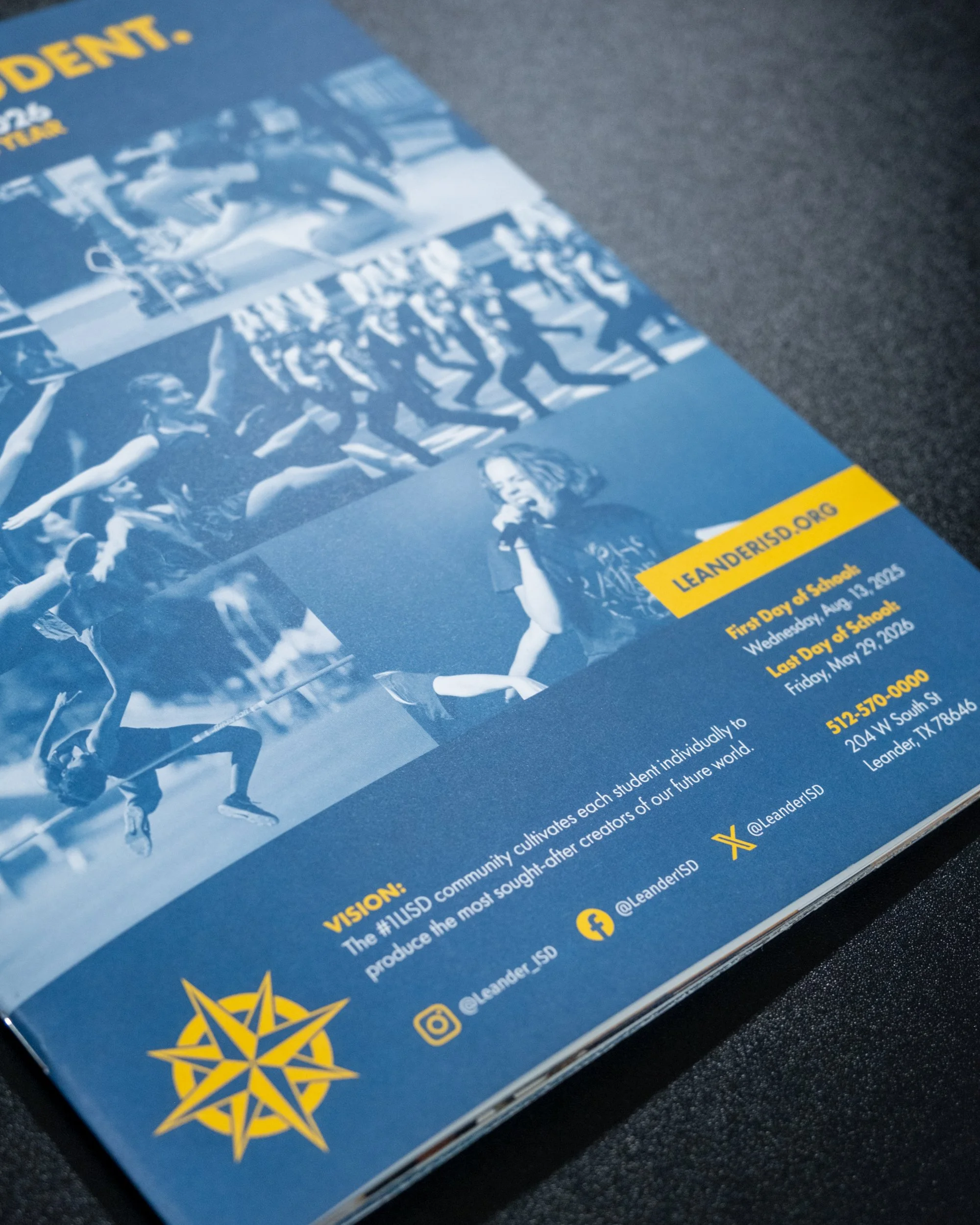
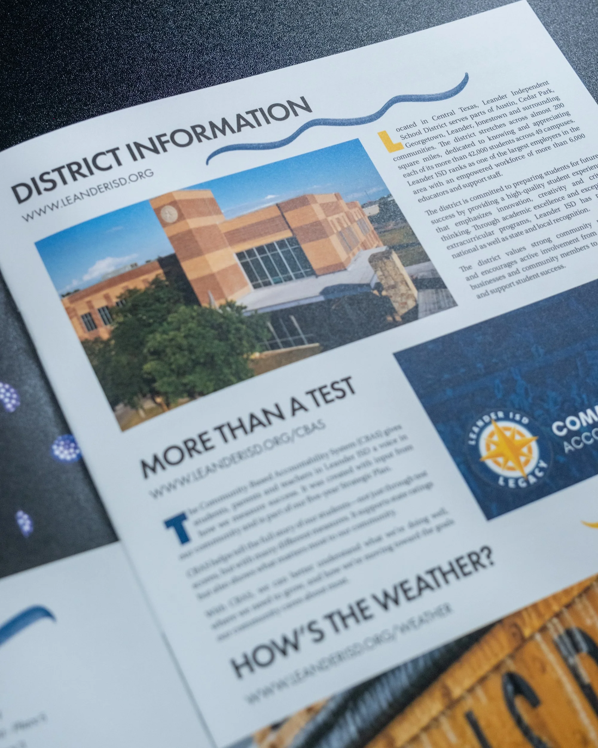
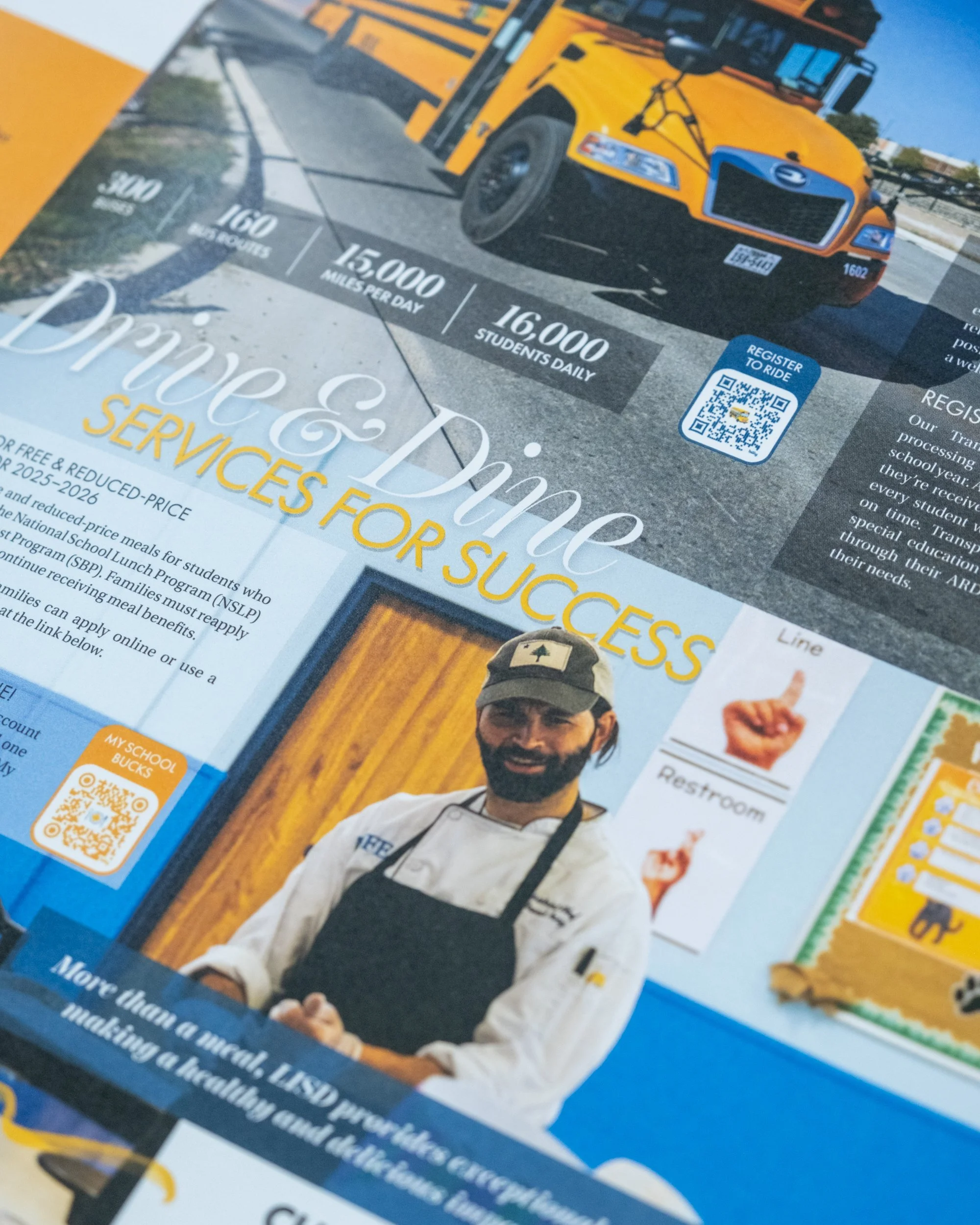
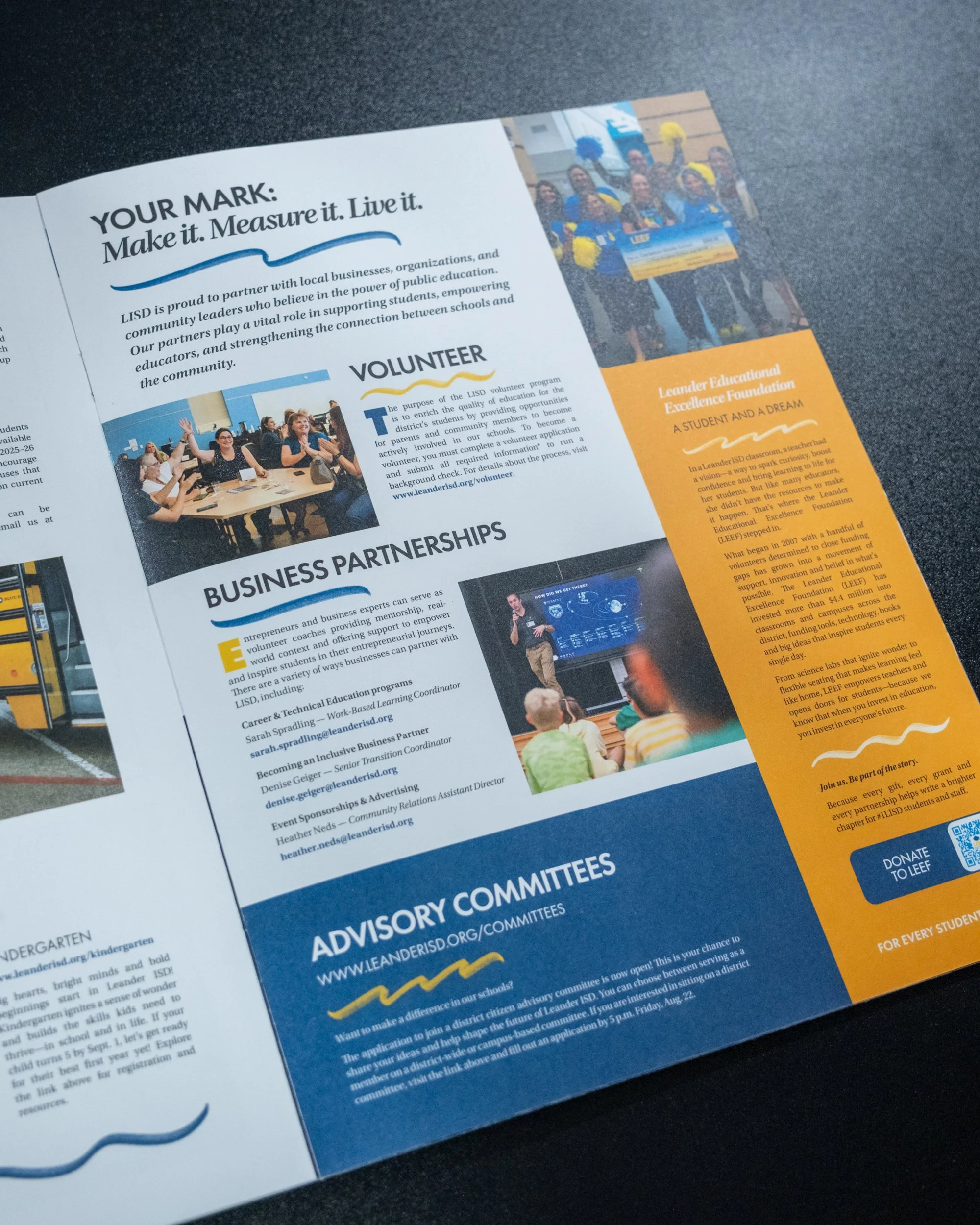
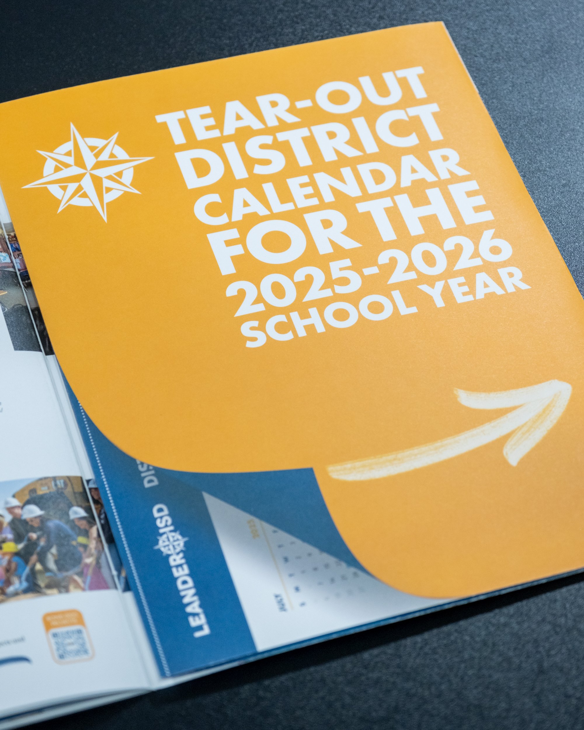
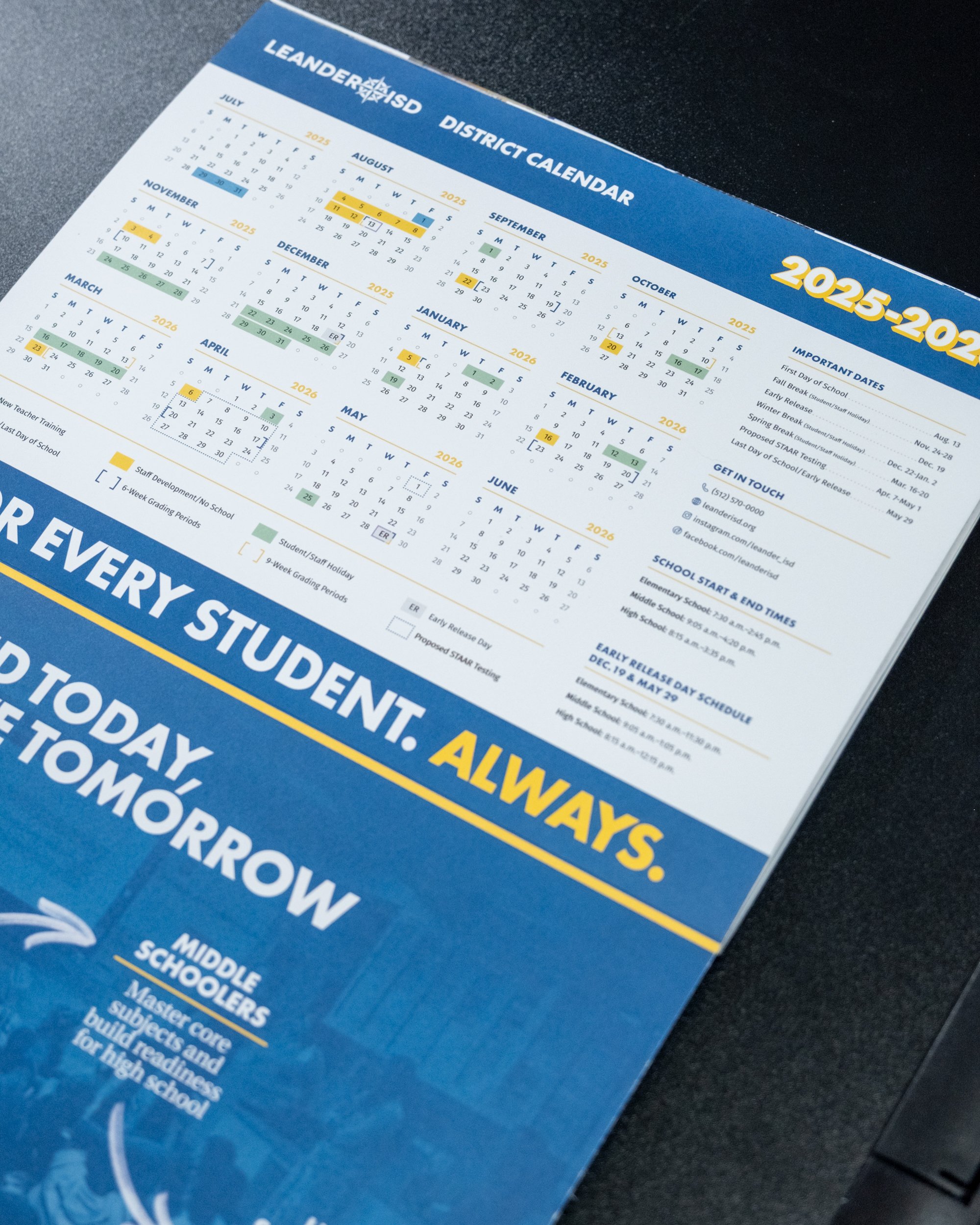
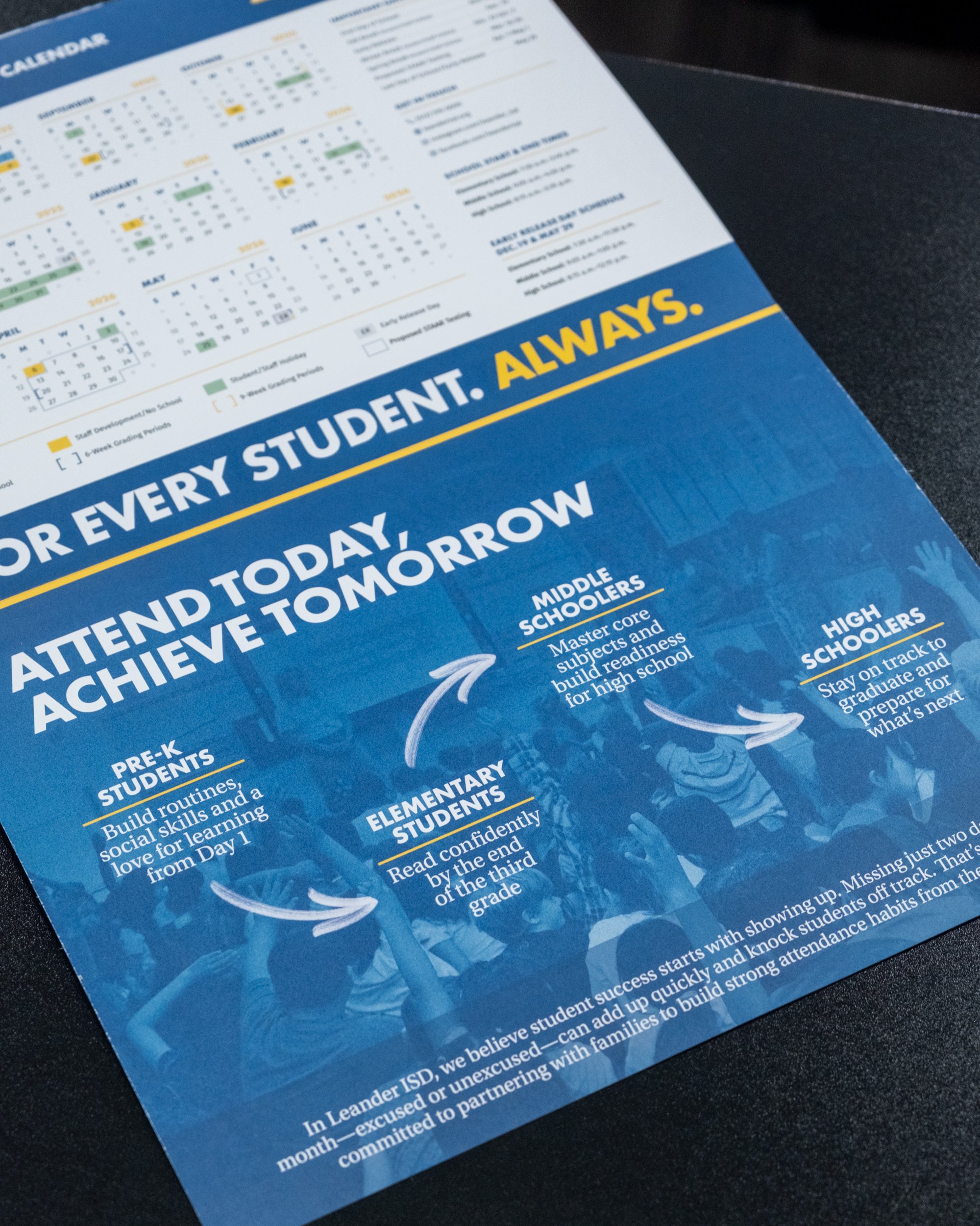
Over the summer, as a central part of our enrollment marketing campaign for the 2025-2026 school year, we decided to put together a publication that would be mailed out to about 40,000 homes, specifically in areas that have seen the highest number of students transfer out of the district in recent years. We wanted to send folks something that would inspire them to give Leander ISD another look, if they’d been enticed away by alternative options like charter schools, and a great back-to-school resource that’s informative and encouraging to everyone who’s chosen to stick around.
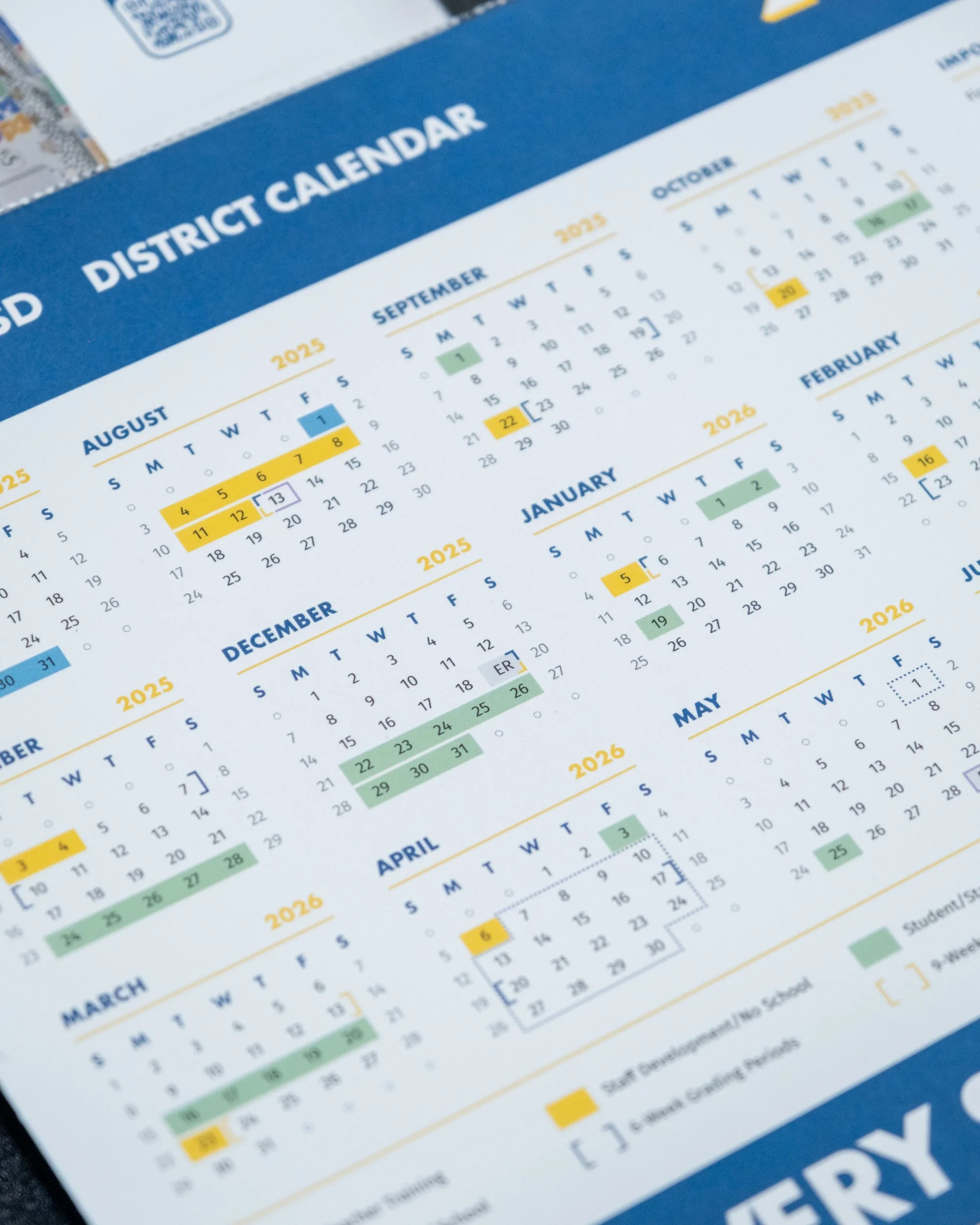
Working directly with the Chief Communications Officer for content, I designed and built the entire booklet, including an 11x17 perforated tear-out of the academic calendar for the new year as part of the back cover.